After the User Experience
Designing for BRCK
Designing for the BRCK involves more than most tech design processes coming from the African startup space, since we have to deal with hardware as well as software.
Many designers get the opportunity to work on software (UI) and print at some point in their lives but very few get to touch hardware. BRCK is a merger of both and that’s what makes it the ideal testing ground for a designer willing to go the extra mile.

Having been a designer for over 12 years, I have worked on graphic design projects, print work and web design (UI), but never got the opportunity to be part of a team that builds hardware.
The challenges one faces are tougher because one has to think of the product from a holistic view and not just one angle eg : A UI designer’s focus is only on a users screen and not print.
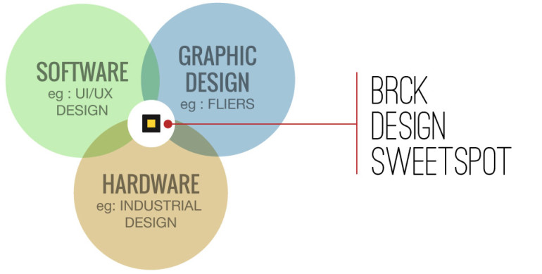
The BRCK is made up of :
- Hardware (The physical BRCK),
- Software (Firmware / OS that sit on the hardware and the cloud used to manage the BRCK remotely via the internet)
- Print (Packaging box and User guide material.)
All this has to merge seamlessly so as to ensure the end user gets a product that’s easy to use right out of the box.
User Learning Curve
All products have a learning curve when it comes to user interaction. Some products tend to have a steeper curve than others if :
- The product is new in the market or
- If the product is a reinvention of what already exists.
Some physical products that already exist and have a predefined way of user interaction, it’s much simpler building a new product on that mindset.
The BRCK falls into the reinvented bracket. WiFi routers were there before, but what our team behind BRCK is out to do is build a product that solves the problem of Internet connection in emerging markets using a solution that’s tailored for those environments. This means unreliable power, power surges, and a failover from “normal” ethernet internet into wireless 3G.
By so doing we had to look at the typical pain points people face while trying to get online then design and build a product tailored to those needs. We had to do away with the typical stereotypes of what a router looked like and how they worked thus creating a product that would be:
- Mobile – For when you’re mobile
- Versatile – Made to work where others won’t
- Powered (Rechargeable battery) – Thinking through power as much as connectivity
- Extendable – A platform to build on with software or hardware
- Cloud Managed – Manage your BRCK from anywhere
The BRCK was a product that was designed and functioned totally differently from other WiFi routers so we had to communicate well in order to minimize the learning curve and frustration of having to set one up.
The Unboxing process
Let’s jump 12 months from when we started this process, almost all the work is done and the first batch of the BRCKs have be shipped. Our team has put a lot of attention in designing and building a product we believe will deliver great experience. However, like all other products there are things you will learn once someone else (a customer) interacts with your product for the first time.
Having interacted with the product for months over, we had our design thoughts set out based on our understanding on how users would interact with what we had built. That said we weren’t too naive to think we wouldn’t have to make some minor changes based on the feedback we got after running a few internal UX (User Experience) sessions.
What we got to learn was that we shouldn’t assume some steps are obvious. Some of our design thoughts did contrast with what we saw. BRCK is a merger of hardware and software, with the process of how to setup being explained on a single A4 sheet of paper (The Quick Start Guide – the document in the packaging that explains the steps you take to setup your BRCK for the first time ). The BRCK did work great but our communication on how to get the BRCK working on the “quick start guide” had to be thought through again.
This forced us to go back to the drawing board and solve some communication pain points that hindered users in getting their BRCKs up and running in minimal time. Our focus now was to give more detail on the quick start guide at the same time to try make sure we do not clutter the page with extra information.
What we Learnt and changed
After opening the packaging most people grabbed the BRCK, picked the quick start guide and quickly browsed through it without reading the content. It was only after they couldn’t figure out what to do that they jumped on to the quick start guide.
Some of the core lessons we got to learn from the users were:
- They weren’t sure which side of the MICRO-USB CABLE went where.
- When the BRCK was charging most thought it was ON.
- How long does it take to view a WiFi connection.
After getting this feedback our goal became to try minimize the setup process time. From when a user unboxed their BRCK to when they were fulling registered at an average of 20 minutes to 10 minutes.
What did we have to do so as to achieve this? We had to reduce the steps and better explain each in better detail. This doesn’t mean we had to add text. They say an image is worth a thousand works. We set out to use imagery to better explain the steps one would take to setup their BRCK.
We replaced certain graphics and added some in order to achieve this. Below are examples of some of the changes we made.
Old and New visual of the first setup steps
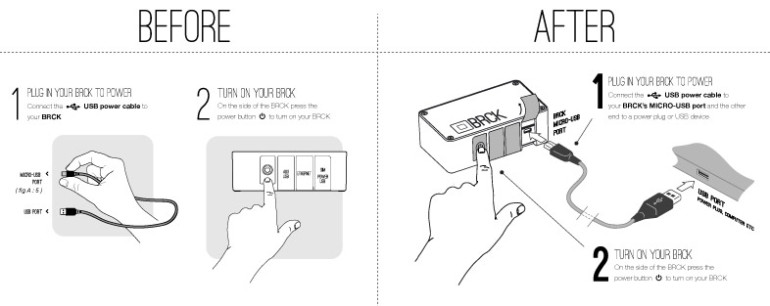
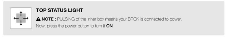
The Status light was confusing to users when they first plugged in their BRCK.
So we added a graphic to explain this better
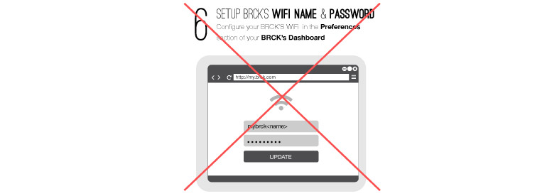
We then set out to remove the setting of the WiFi from the registration process so as to reduce the steps.
Finally our greatest challenge was how do we communicate what the status light colour codes meant. The top light of the BRCK is the main physical communication point between the hardware and the user. This is done using different colors spinning and pulsing. The Quick start guide was printed in grey scale and we needed a way of conveying this information to our user without using text. We then came up with the colour code charts.
This are business sized cards that visually illustrate what each colour is and does.
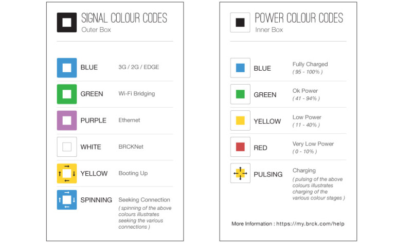
Below are the full versions of both.
BEFORE
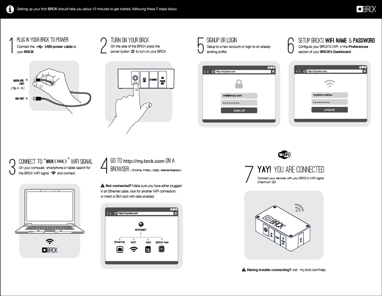
View More : Download
AFTER
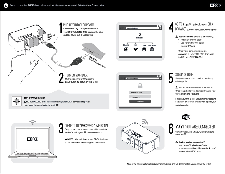
View More : Download
Good work … 🙂 All the best … 😉